Home
Christine Graf

Main navigation

  • Home
  • About

Breadcrumb

  1. Home
  2. abstract painting

abstract painting

By Christine Graf, 14 May, 2017
Imagem de ELLE RITTER por Pixabay

The other red

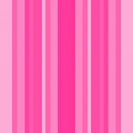
I learned that the choice of colours depends on age and on gender.
Considering my age, it’s not really clear to me why I chose shades of pink as the main colour in this painting as this colour is referred to naivety and girlish behaviour. But is also stands for romantic, charming woman, which I am, quite often 😉
And the orange tones I added to include my nearly never-ending energy and enthusiasm.

All in all, this painting seems to me very powerful, warm and feminine.

  • abstract painting
By Christine Graf, 23 April, 2017
temperaments

Perfect blue

I was searching for a long time for the perfect blue, played around with different pigments, lost my track a bit through the dead of my mother and finally felt that I need another colour in this painting.
My perfect blue has got a dash of green, a green I created by adding some terre jaune italienne to the Lapis Lazuli blue.
Blue stands for the ratio, the cool analytical part of a person. Do you remember?

  • abstract painting
  • making of
  • thoughts
By Christine Graf, 10 March, 2017
silver

Silver Grey

It is often said that grey is not a colour, but a statement, if you want to hide or remain invisible (the grey mouse). Sometimes, instead of positioning oneself for one side or another, we are looking for a way in the middle between two opposites, between white and black.
But grey can also be understood as a departure from all colours, all affluence, as a conscious counter-design to a noisy world.
To be honest, I did not have these thoughts when I started the painting. I just wanted to experiment with black and white pigments, dissolved in acrylic and a silver oil paint.

  • abstract painting
  • making of
By Christine Graf, 17 February, 2017
laboratory

Exploratory Painting

I am always experimenting with different natural materials, such as lime, marble powder, fine sand, ash, to create depth and structure.

  • abstract painting
  • making of
By Christine Graf, 11 February, 2017
yellow

Yellow

In the middle of the winter, when it became really cold, grey and windy, when the sun did not shine for a few days, I was longing for the blue sky and bright light. I thought of using yellow, the colour of the sun, to create a painting which could brighten up this time of the year.
For this painting, I used five shades of yellow pigments, mixed with titan white to apply it in layers for creating a warm, sunny tableau. Lime and marble powder were used for some surface structure and to let the pigments react with it.

  • abstract painting
  • thoughts
By Christine Graf, 1 January, 2017
signatures

The Signature of my Art

Signing my paintings is always the last part of my work, when signed, the painting is ready. To me, it’s the sign of completion, like an approval of the result of a creative process.

  • abstract painting
  • making of
By Christine Graf, 23 October, 2016
Sea

Turquoise

Blue again, in all its shades, as the light let it seem and the wind stirs it up.
In this painting, deep blue and green, with dashes of turquoise.

  • abstract painting
By Christine Graf, 7 August, 2016
charred wood

Structures and Surfaces

So far, I intensively worked with colours, their production and application, and I learned a lot about the interaction of various binders, and produced some really cool effects 🙂
For example, I got the idea for my paintings "After the Fire" and "Ashes" when cleaning the fireplace after a nice and cosy evening in front of it. The picture above is a montage created from a detail of my painting After the Fire and charred wood.
The surface of these paintings is relatively flat, it gets depth through the application of different thick layers of colour and raw pigments.

  • abstract painting
  • making of
By Christine Graf, 31 July, 2016
gold

Gold

I got some gold leaves and played around with it, tried to show the dirty and shiny sides of gold, by applying layers of sienna, ardoise, noir de vigne, titan oxyde.

Gold – symbol of power, wealth, purity, dead, war, earth, slavery, blood, jewelry, gold rush, enlightenment, greed, cyanidation, altering nature, wedding ring, currency speculation, spiritual values, imperishability, eternity.

  • abstract painting
By Christine Graf, 10 July, 2016

Blue and a fine green line

After Red, I made Blue and a fine green line.

Here again, I used different shades of one colour: grated Lapislazuli, which gives the ultramarine, indigo and Bleu Ercolano, a synthetic pigment.
Applied in layers with different binders, it creates wonderful colour effects such as the fine green line.

  • thoughts
  • abstract painting

Pagination

  • Previous page
  • 4
  • Next page
abstract painting

Connect with me

  • Instagram
  • Twitter
  • Flickr

Gallery

shield
old workshop
ink 008
rubble
rust
ink 012

Recent blogs

Sterben lassen

10 months 4 weeks ago

Ich glaube, viele haben eine Vorstellung wie ihr Leben enden soll. Die meisten hoffen, dass es schnell und friedlich geht. Einfach umfallen…

Read more

Gizeh, Kairo, Pyramiden, Pharaonen

Wool and Milk by Nathan Doss

1 year 2 months ago

Ich tu mich ja immer ein bißchen schwer damit so viel Aufwand für nur ein Reiseziel zu betreiben. Aber diesmal war es mir nicht anders…

Read more

Giza, Cairo, Pyramids, Pharaos

wool and milk, sculpture by Nathan Doss

1 year 2 months ago

I always find it a bit difficult to travel far for just one destination. But this time I couldn't do it otherwise, so I ended up travelling…

Read more

Archive

  • May 2024 (1)
  • January 2024 (2)
  • July 2023 (2)
  • November 2022 (1)
  • June 2022 (1)
  • May 2022 (1)
  • March 2022 (1)
  • January 2022 (2)
  • December 2021 (2)
  • October 2021 (1)
  • August 2021 (1)
  • July 2021 (1)
More